
The IT people, who are people people
The meaning behind ‘Truis’
Computer Merchants was founded 40 years ago with a mission to create innovative IT solutions that align with their customer’s unique situations and ambitions. However, as technology has advanced and our client’s needs evolved, so too have our capabilities and market coverage. Today, as a multi-vendor software and hardware solutions partner, we help clients across Australia and neighbouring countries to prosper and grow.
Truis derived from the word ‘Altruism’, which means – the principle and moral practice of concern for the happiness of other human beings. The name was inspired by the brand’s core values – empathy and transparency.

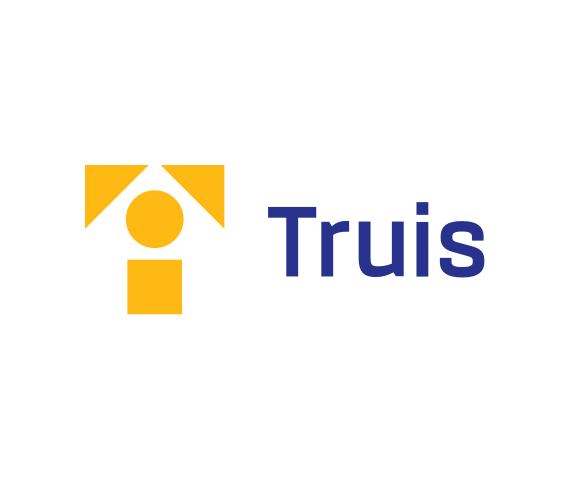
Truis logo
The Truis mark was created using a framework of simple ‘puzzle pieces’ that come together to represent a team of problem solvers.
Reflecting the company’s people-first approach, the puzzle forms a simplified person at the centre of the mark. This puts people (clients, staff and partners) at the heart of the brand and represents Truis’s dedication to, and reputation for excellent customer care.
The remaining two triangular ‘pieces’ come together to form a stylised ‘T’ for Truis. The completed marque gives a sense of movement and suggests innovation, agility and progression towards clients goals and a bold future.

The wordmark reflects the technological side of the business while retaining a friendly, approachable appearance.
The completed logo is bold and minimal, reflecting a confident, trustworthy and expert organisation with people at the heart of everything they do.
‘Truis Yellow’ is the hero colour for the new brand identity, it brings a sense of energy to the overall look and feel. A Vivid blue compliments the yellow and gives the brand a contemporary, innovative appearance.

Brand tools
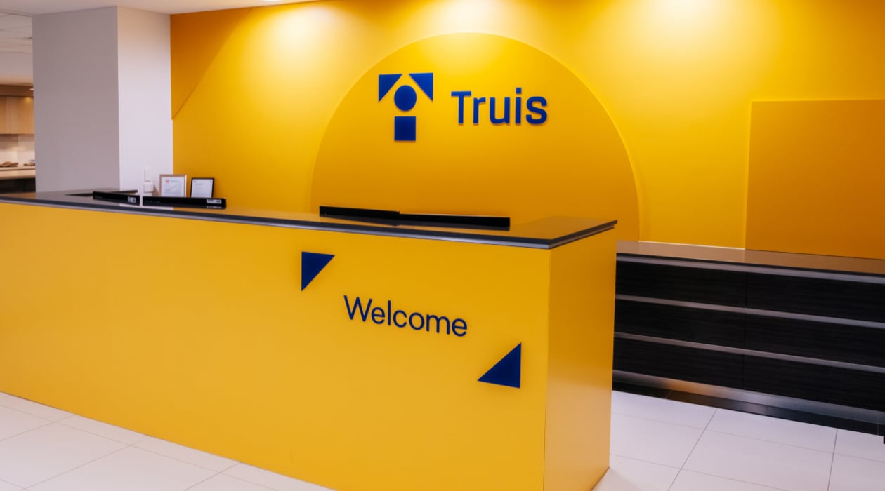
The updated brand identity includes a suite of flexible brand devices that help create a consistent and engaging feel across all of the brand applications. Shapes from the new logo frame photography, key focal points and headlines. Each tool is strategically placed to help emphasise the problem-solving aspect of the brand while putting people front and centre.

Website
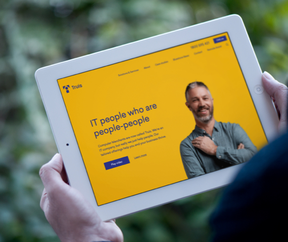
Truis has developed a new website that focuses on user experience while showcasing the new brand identity, tone and position in the market. The website mixes together with a range of content types – flexing the brand’s colour palette to bring a sense of warmth and clarity throughout.
From Computer Merchants to Truis, this evolution injects a well-needed human-touch into the tech-world. Unlike your traditional IT company, we are standing for something much bigger than just IT solutions. By putting ‘people’ at the heart of everything they do, Truis looks beyond IT to unlock untouched business potential in today’s market.
Subscribe to stay up to date with the latest news and updates
Related posts
Navigating VMware changes in the wake of Broadcom acquisition
The human-centred IT solution provider, Computer Merchants, has rebranded as - Truis. The name change and new brand identity reflect and celebrate a rich history of core values and a clear focus on the future.
Read articleThe road to sustainability
The human-centred IT solution provider, Computer Merchants, has rebranded as - Truis. The name change and new brand identity reflect and celebrate a rich history of core values and a clear focus on the future.
Read articleHow managed services can help you achieve the 'E' in 'ESG'
The human-centred IT solution provider, Computer Merchants, has rebranded as - Truis. The name change and new brand identity reflect and celebrate a rich history of core values and a clear focus on the future.
Read article


